
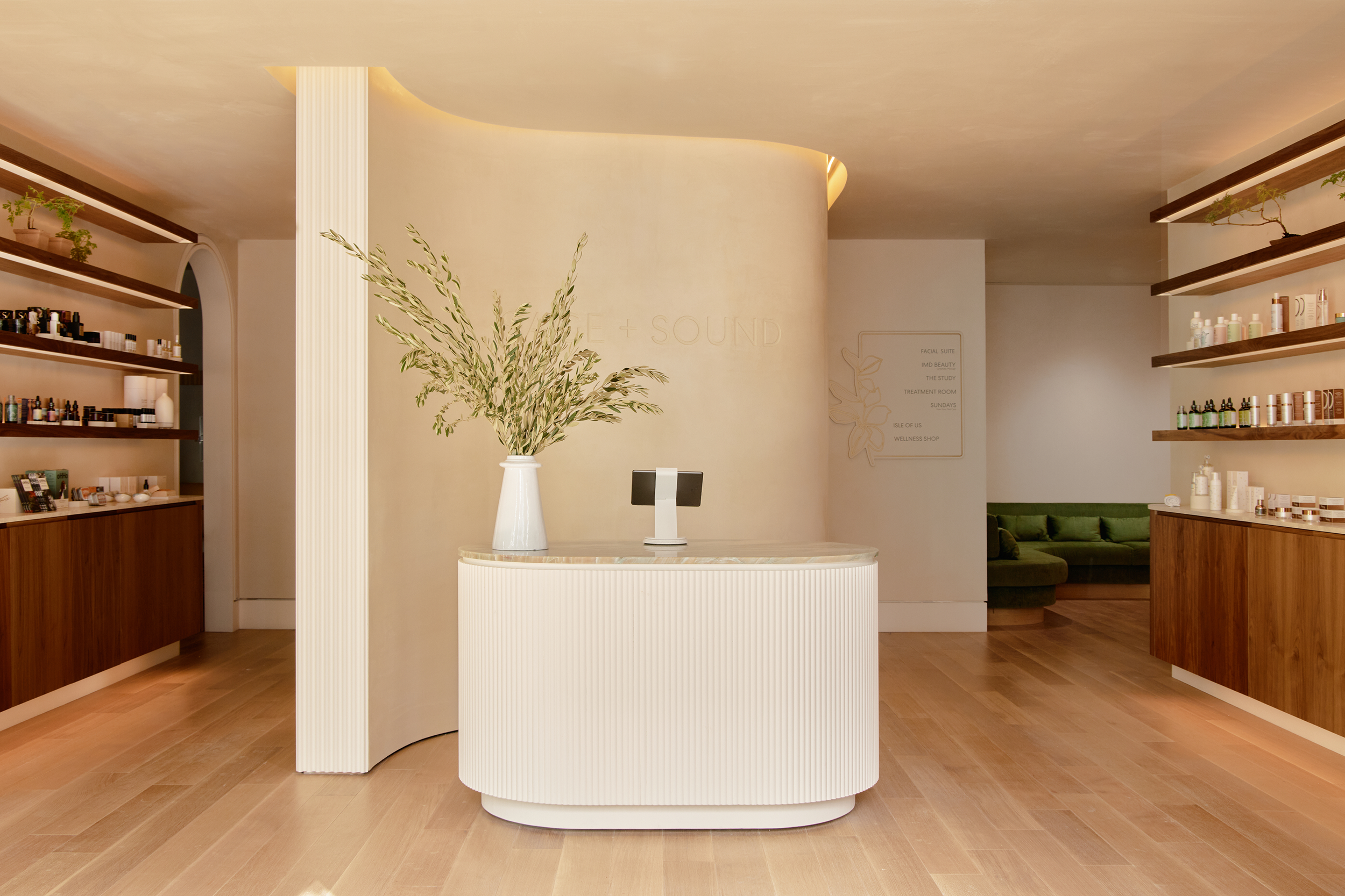
What began as a focused UI/UX audit and a series of small site improvements evolved into a complete website redesign and build. Through the audit, I helped uncover foundational UX and visual issues that presented an opportunity to rethink the experience from the ground up.
Sage + Sound
Agency:
Avex Designs
Timeline:
5-6 months
Focus:
UX/UI Audit • UX/UI Design • Creative Direction • Web Design • Prototyping • Email Design • Full Build
Tools:
Figma
From Audit
to Full Build
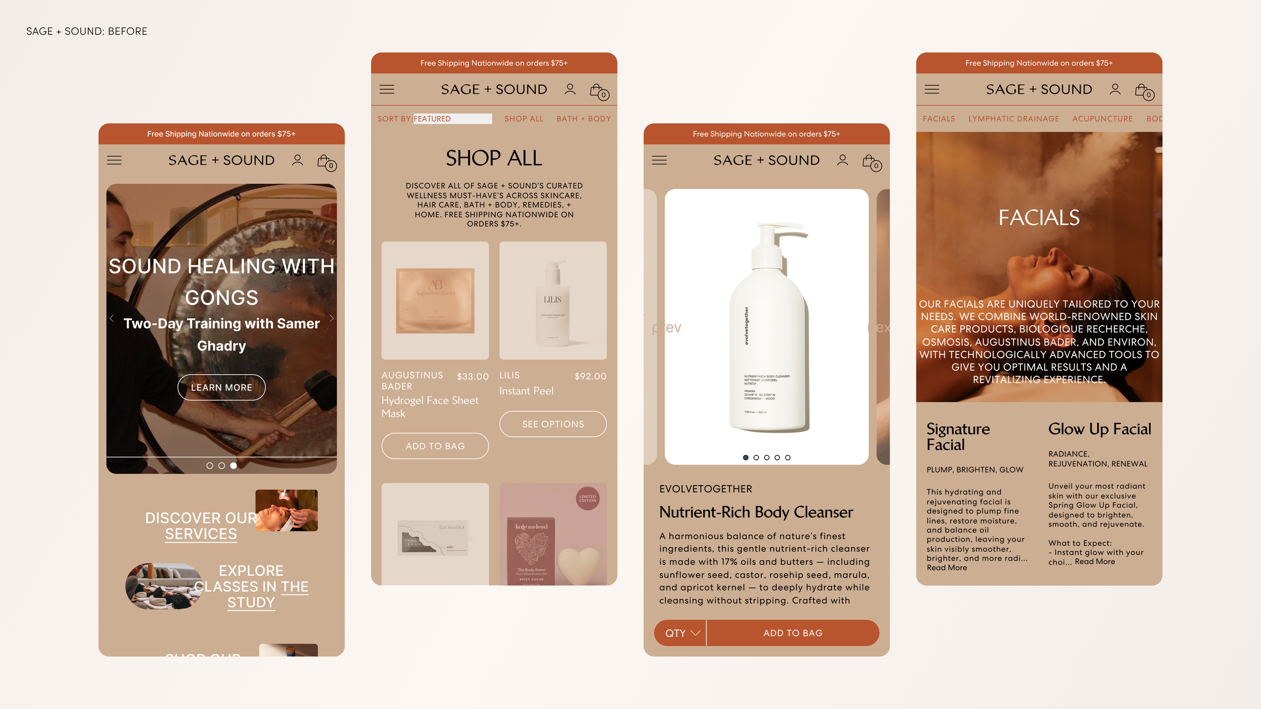
The project began with a focused goal: evaluate the client's existing website, identify opportunities for improvement, and make targeted updates through an ongoing design retainer.
As we worked through a comprehensive UI/UX audit of the existing experience, it became clear that the opportunities extended beyond individual page-level improvements. We uncovered baseline UX, visual, and structural issues that were limiting the overall experience.
Those findings began to shape the direction of the project. As we moved from audit into design exploration, the client responded positively to the proposed improvements and ultimately decided to expand the engagement into a full website redesign and build.
What started as a series of incremental improvements became an opportunity to rethink the experience more holistically—from the underlying user experience to the visual design and final digital execution.
Establishing the
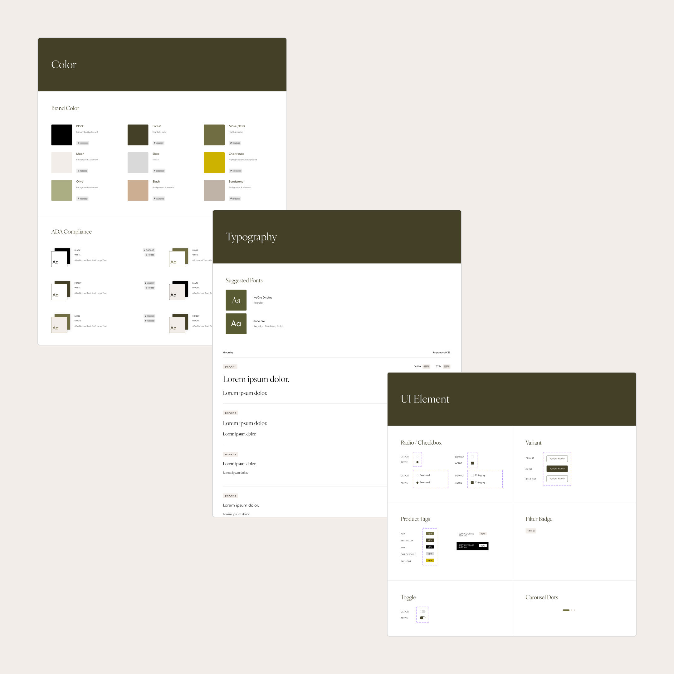
Visual Foundation
Before moving into page design, we established a refreshed visual foundation for the site. We explored typography, color, and UI elements to create a flexible design language that could carry across the website and into other digital touchpoints.
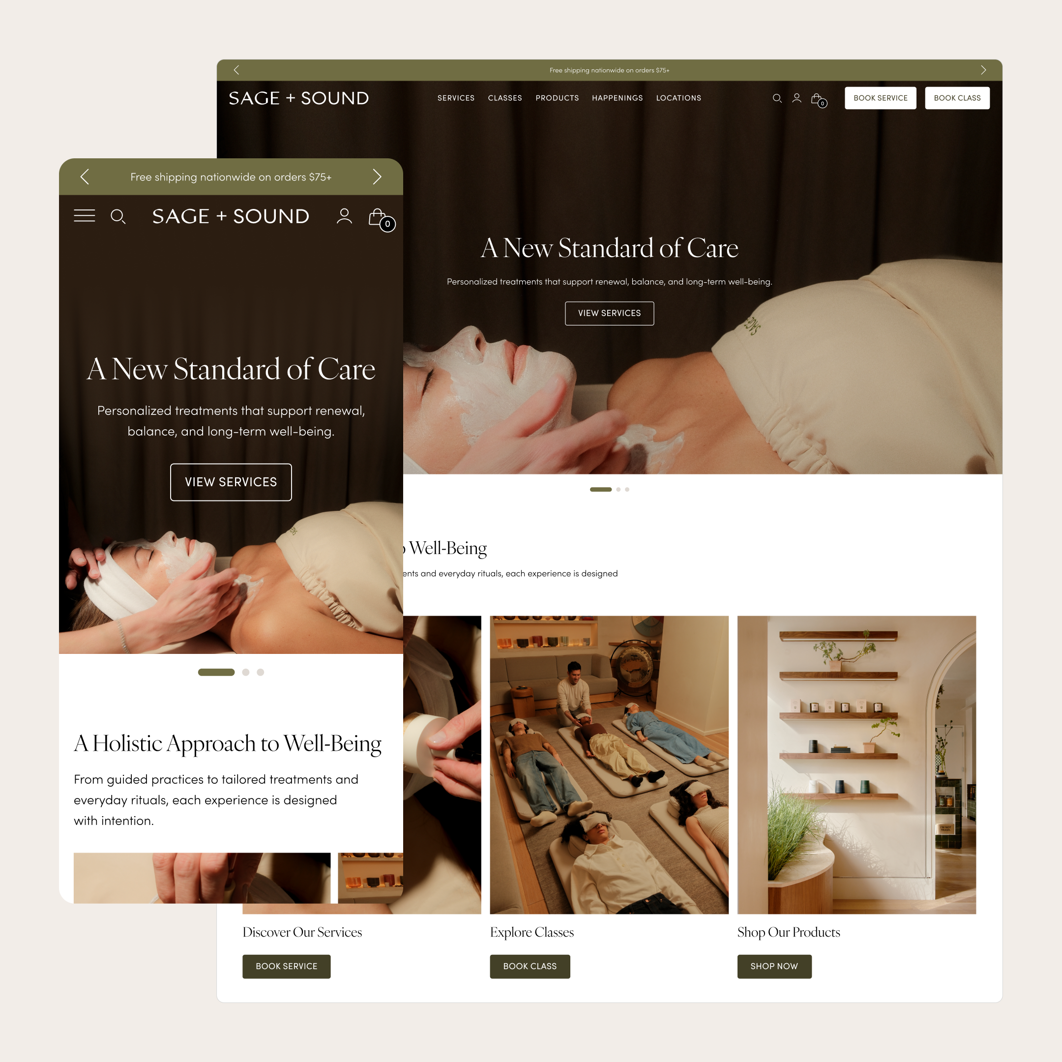
Reworking the Experience
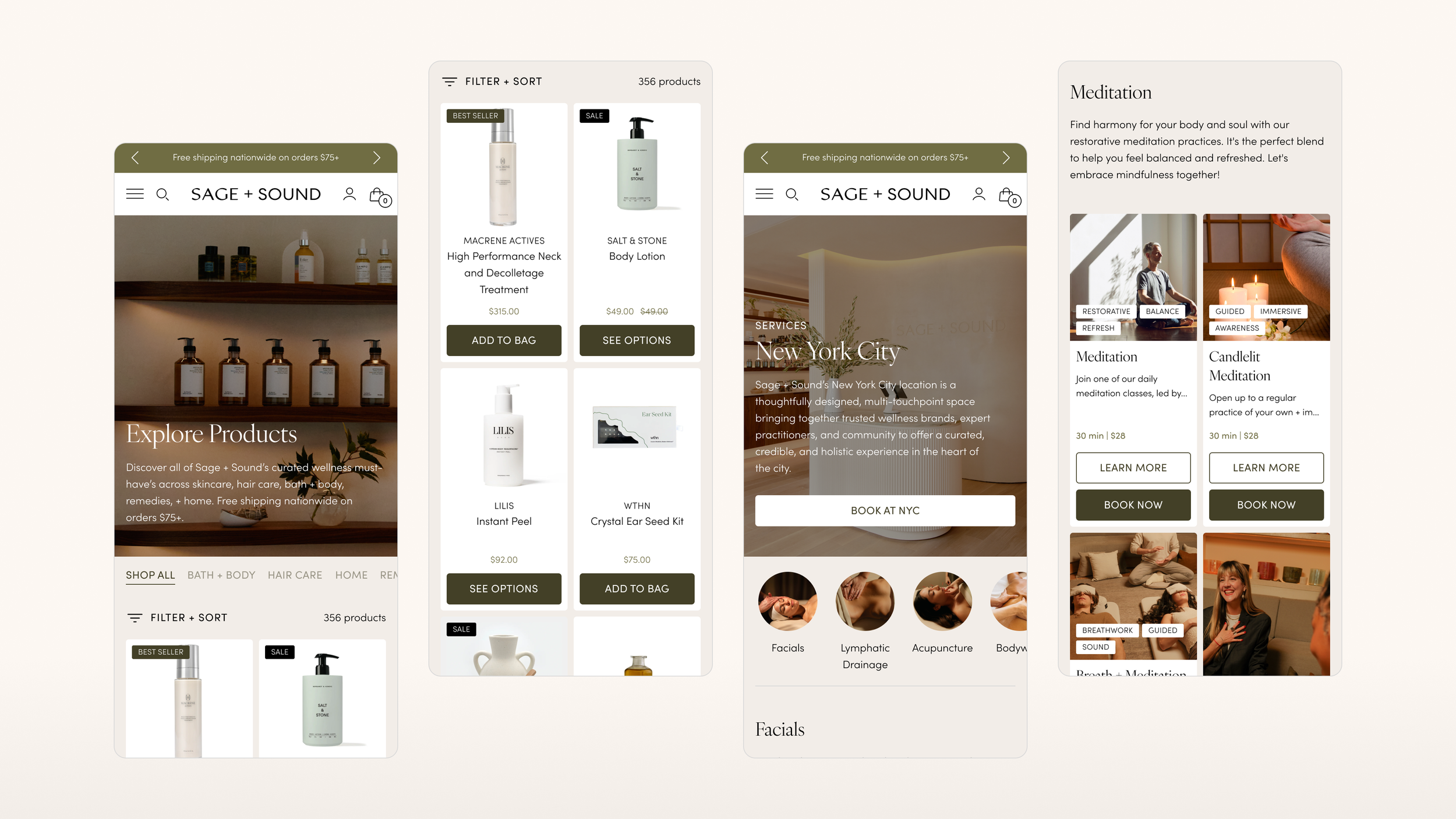
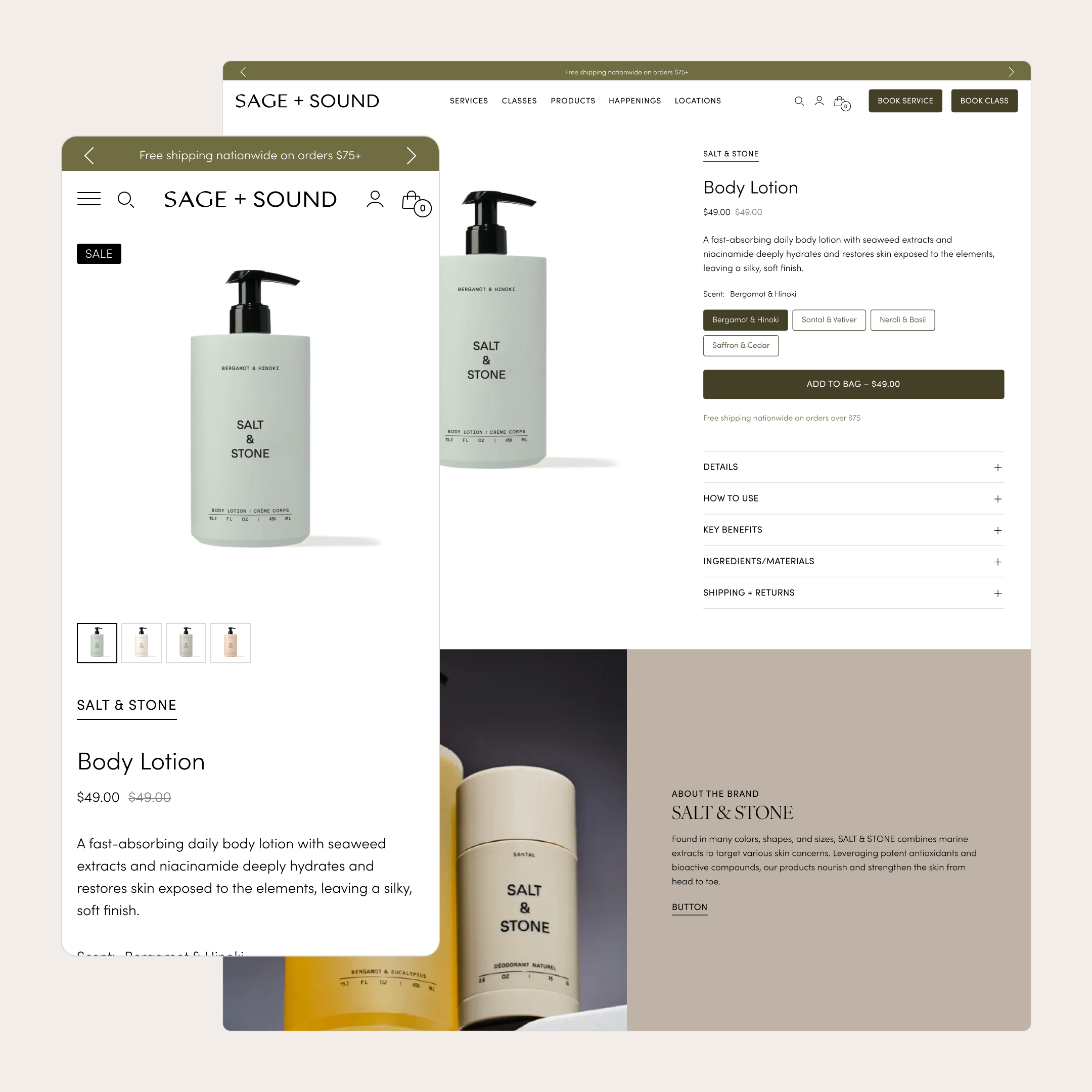
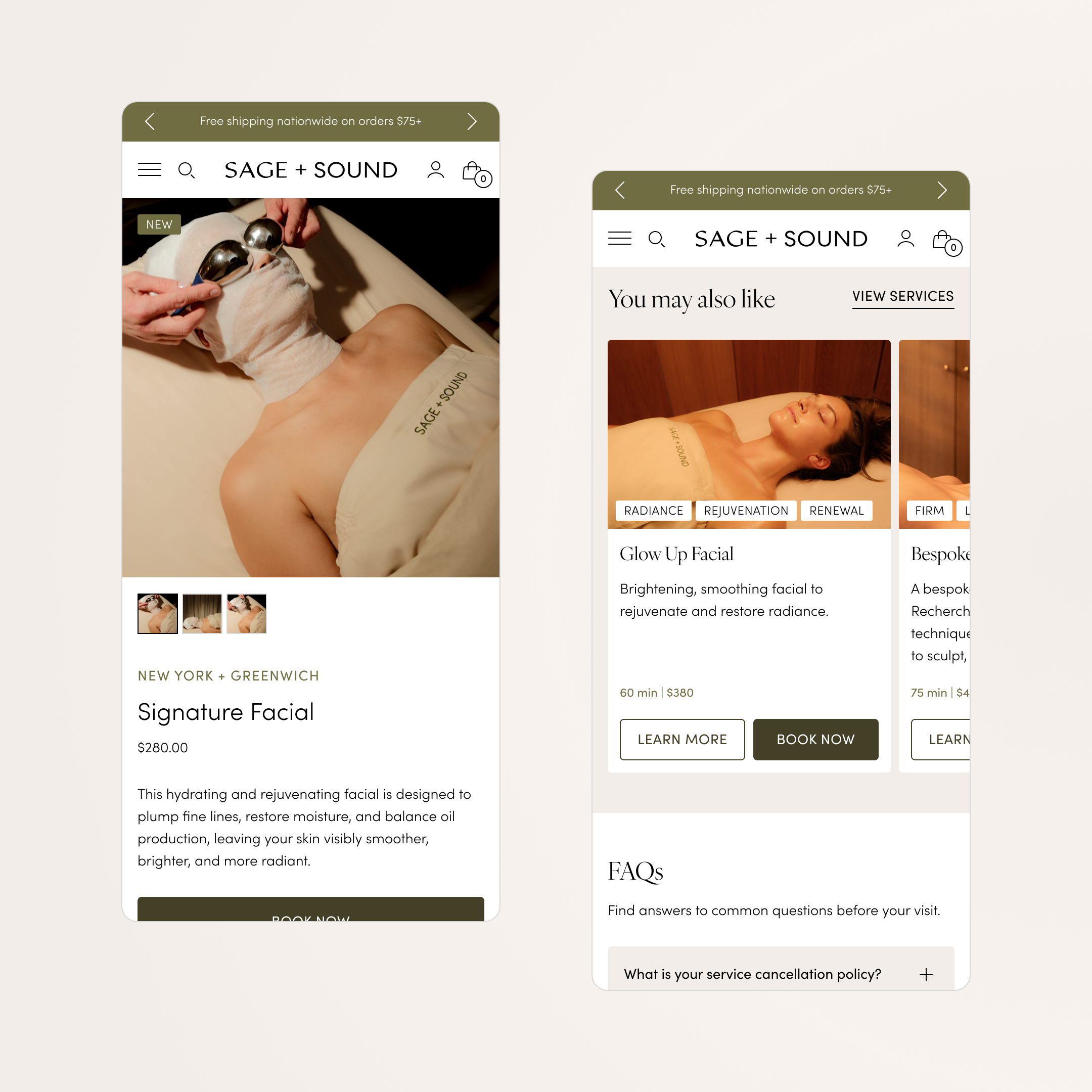
With the visual foundation established, we moved into page-by-page design, rethinking how information was structured and presented across the site. Each template was designed to address existing UX and architectural issues while creating a more consistent, scalable experience for customers.
01 — Prioritized information
Key details are surfaced earlier in the experience.
02 — Clearer hierarchy
Content is organized into easier-to-scan sections.
03 — Stronger pathways
Customers can quickly understand their options and move into the relevant service/class.
04 — More scalable structure
The new collection page establishes a repeatable template for future content.
From Website to
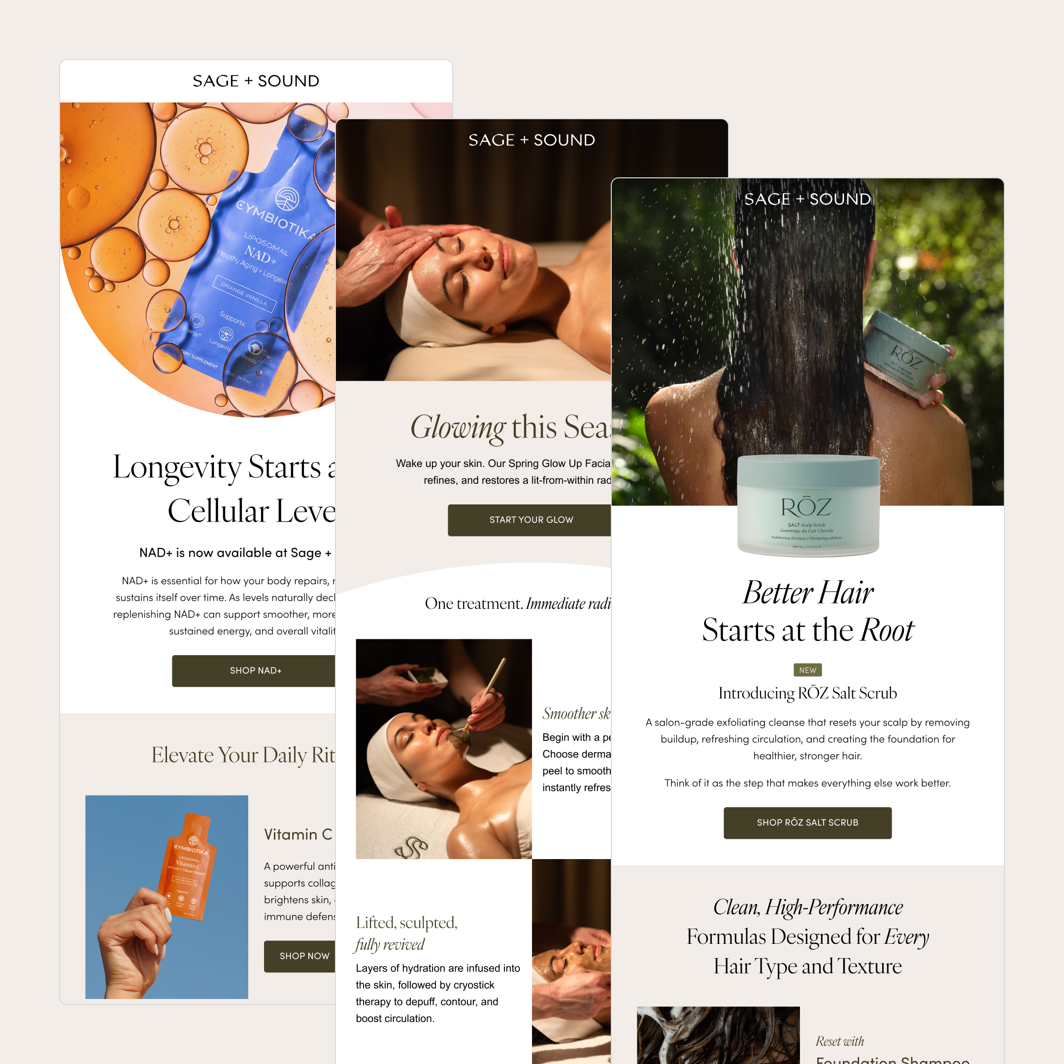
Digital Ecosystem
The refreshed visual language extended beyond the website, creating a foundation that could be carried into the client's broader digital communications.
A Foundation for
What's Next
What started as a focused UI/UX audit evolved into a complete digital redesign and build. By addressing foundational UX and visual challenges, we created a clearer, more flexible experience that could grow with the client's needs.
The project established a refreshed visual language, improved the way information was organized and surfaced, and created a scalable system across products, services, classes, and events—while extending that same direction into email and other digital touchpoints.